
Intro:
The Online Taxes Inc (OTI) site caused significant friction for clients due to its difficulty of use. Tasks such as booking appointments, downloading forms or locating information caused the users frustrations. I was brought in to help the team make the website user friendly by redesign the experience.
https://onlinetaxesinc.com/
Role:
UX Designer & Art Direction Lead
Team: 2 UX/ IU Designers, Web dev
Timeframe: 5 week sprint
Tools: Figma, Usertesting.com, Miro, Slack, Google Suite
Framework

Summary
The tasks that we solved for during the 5 week sprint were as follows: create a user-centered experience for clients, ensure all users can contact us and explain services. These tasks will guide us through our process and help us create a successful experience for both the user and business.
Competitive Audit
After researching best-in-class and out of category sites, we gathered common themes and key take aways.
Bench.co: concise value proposition. Users know exactly what they can do/buy on the site. Following best practices by keeping 5-7 items on global nav.
Gusto: excellent page layouts
Quickbooks: pricing is presented in groupings clearly and easy to digest. Navigation follows best practices and does not overwhelm users.
H&R Block: hero offers two CTA’s (primary and secondary) for different user needs

User Interviews
Given our limited time, we were able to recruit and interview 8 users for interviews. To prepare for the interviews I created a questionnaire that included items we needed to explore and assumptions that required validation. The interviews were done over zoom or by phone. We required the participants to reside in South Florida and be over 18 years old. User feedback helped direct us in the right way early on and therefore, create user-centered products.

Persona
After reviewing the company’s client demographics, Jose Castro, represents the base well. Most clients are locals from South Florida and are small business owners.

Flow chart
The stakeholders made it clear that they needed our the redesign to provide an easy way for users to contact OTI. This was one of the first problems we had to solve. I created this flow chart with solutions for every type of user (phone, email or chatbox users).

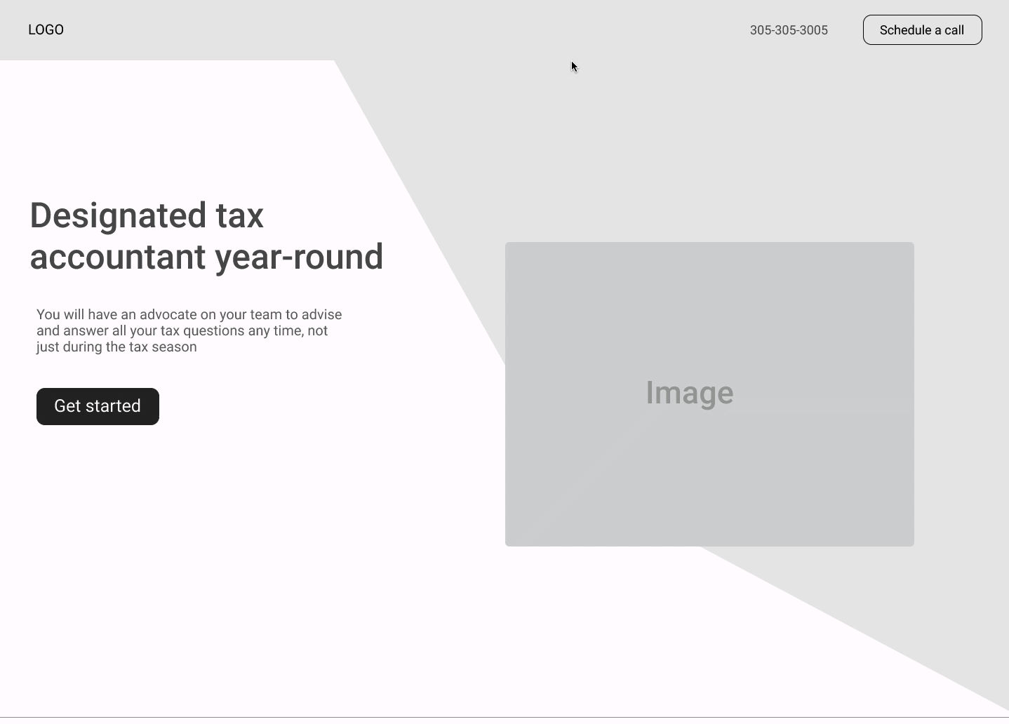
Hi-fi Wireframes
After multiple rounds of iterations and testing we arrived at the final version. Below, you see version 1, 2 and 3 (final).

Solutions:
By applying UX Heuristics to the homepage layout I was able to provide flexibility and efficiency of use for all types of users using the site.
We provided three contact options for all types of users (novice vs frequent). Options consisted of office phone number, Calendly CTA, or chatbox.