Intro
People want to get involved in their communities and help anyway they can. Often, the struggle is they don’t know where to search for volunteer opportunities. We created Better Together to ease the process of finding the right volunteer program near you.
Role
UX/UI Designer
Team: 3 Designers and 4 Developers
Timeframe: 3 weeks
Design Framework

Tools

DISCOVER
We emphasize on the users needs while we conduct our research.
Competitive Audit
Allows us to get inspiration and collect data of what works well.

Best in class
We found high-traffic volunteer websites that had a clear path to completion and defined CTA’s for users.
-Volunteer Match: prominent CTA
-Water Keepers Organization: clear path to completion
-The Miami Foundation: Secondary CTA on nav

Out-of-category audit
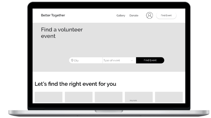
We broadened our research to include prominent out-of-category event websites and found a common use of search widgets on their homepages.
-Event Brite: unique search widget
-Carnival Cruise Line: direct path and guided path
-Ticketmaster: recognizable search widget
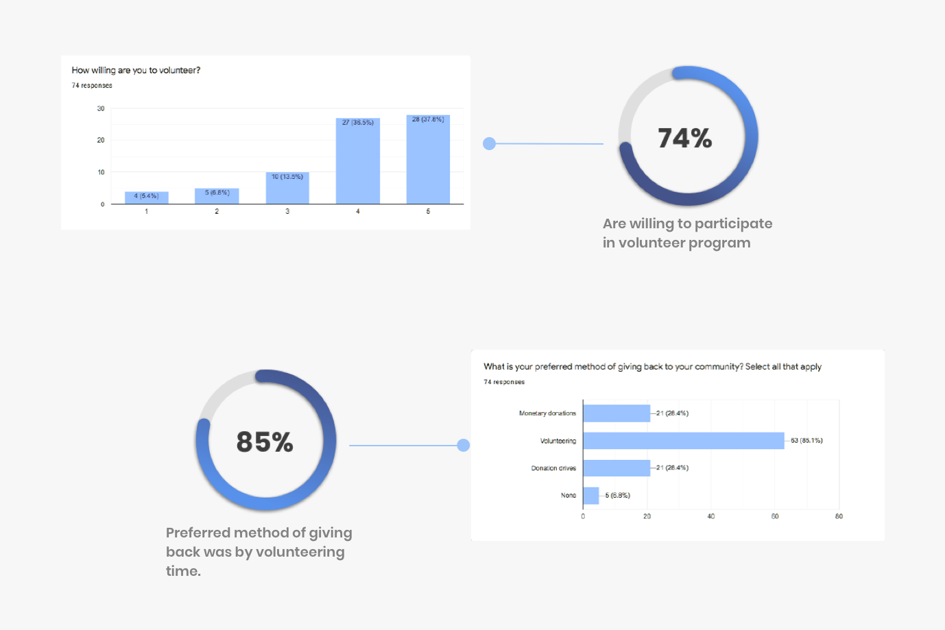
Survey
A quick and efficient way to gather data and get feedback from our users
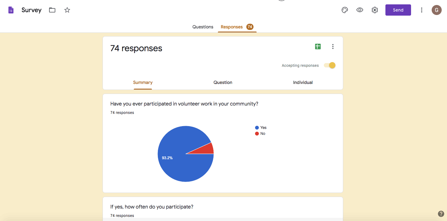
Over 74 participants completed our survey and it allowed us to validate our assumptions regarding the current experience of volunteer searching. It brought insight on the users pain points. Big takeaways that we discovered were the preferred method of volunteering and who our target audience was.
DEFINE
Define target audience and identify needs and pain points.
User Journey
With our target audience defined, we mapped their interaction and identified the pain points, opportunities and preferences in their journey.

MVP & KPI Workshop
Submit all our ideas and collectively discuss and vote for the minimal viable product.
User Journey and MVP Session
After discussing the user journey to understand user pain points and interactions we discovered possible opportunities where we can optimize the experience. By voting and prioritizing we agreed on the MVP must have’s.
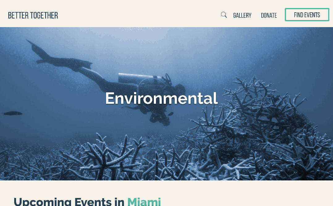
Event module, Nav, Filters, Search widget


Key Performance Indicator (KPI)
Once the features were voted on, the next task was to decide how to quantitatively measure our success. Event attendance was directly associated with the business goal and success of the website- making it the number one method of evaluation.
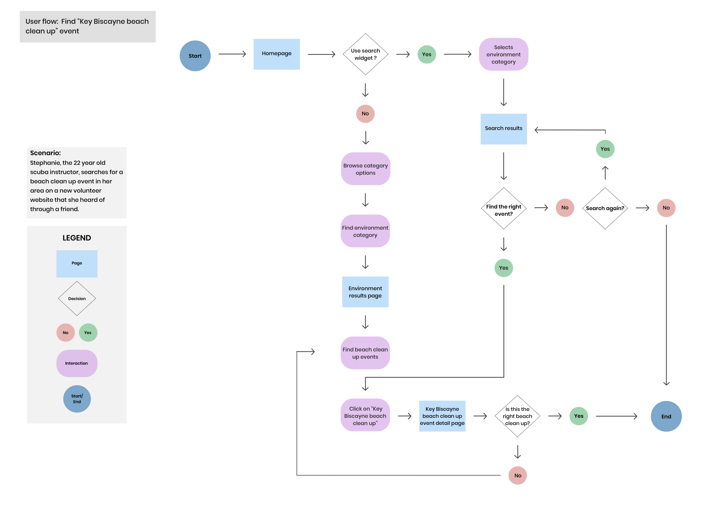
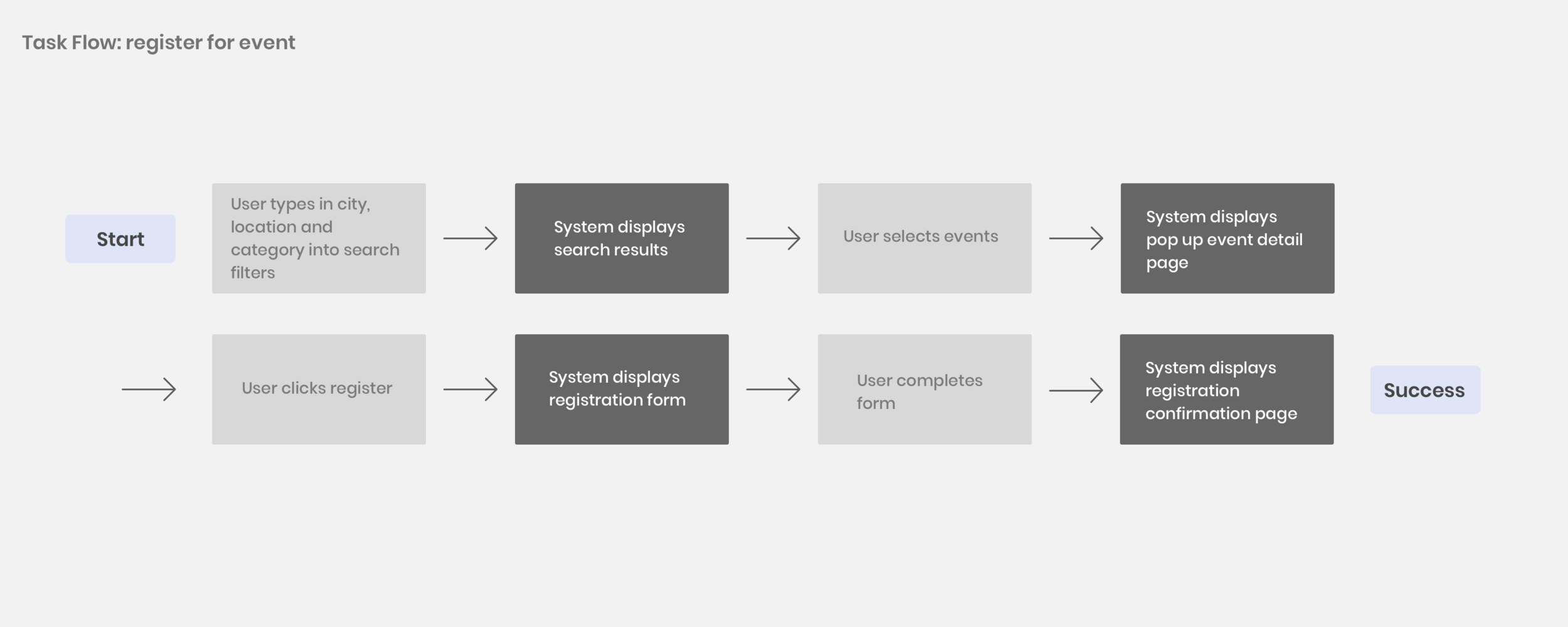
User flow & task flow
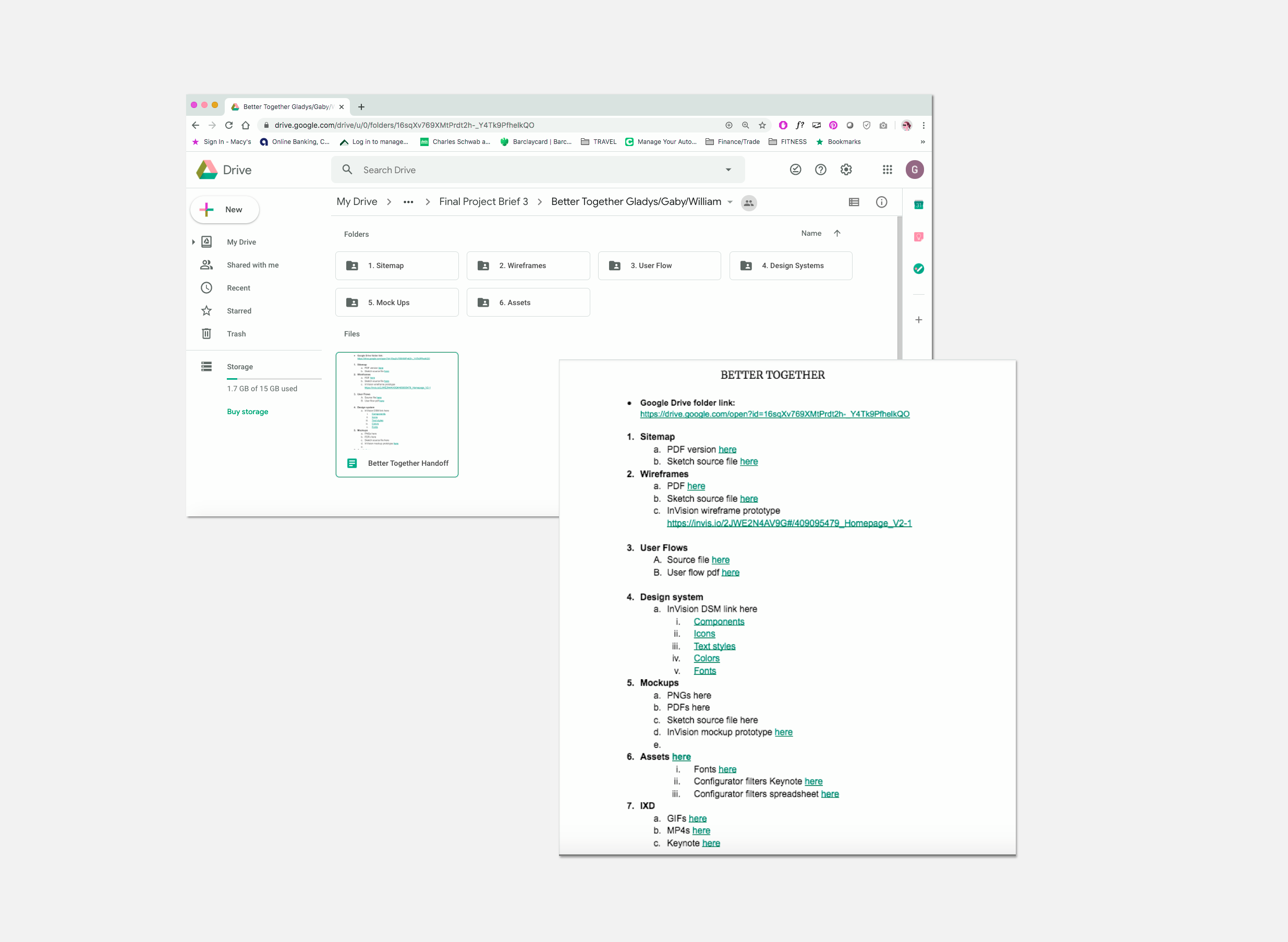
Sitemap

DESIGN
Design Studio: Sketches

Let the drawing begin.
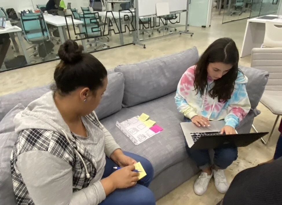
We adopted the Lean UX approach and prioritized rapid sketching and feedback. We understand the importance of collaborating and testing early on in order to reveal what approaches will work and which ones will not.
Wireframes
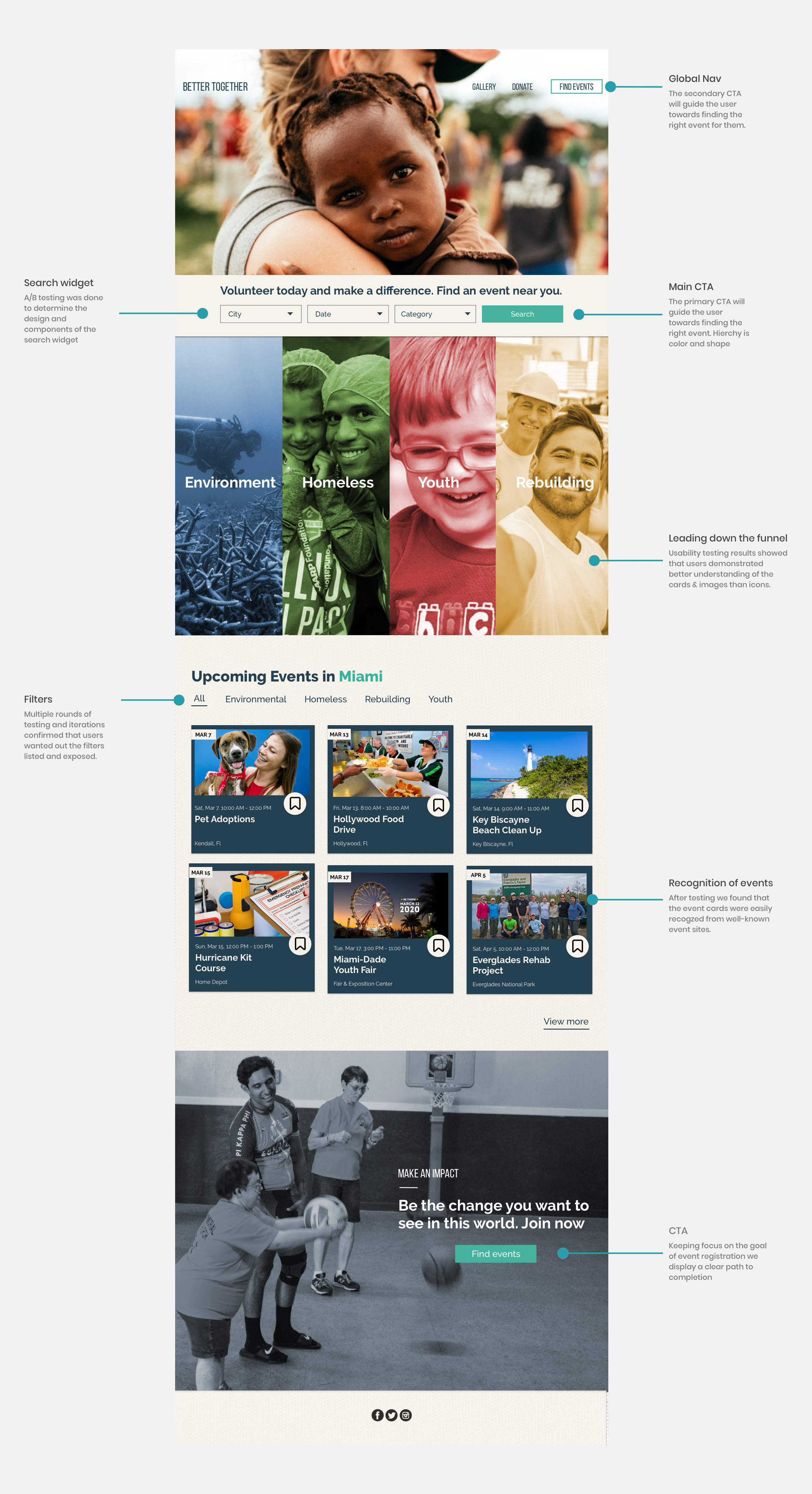
My favorite part. Let’s create hierarchy based on users needs. We used our survey findings to incorporate users needs and wants in the navigation design. Clear CTA, flexibility and efficiency of use while following best practices.


TEST
Prototype
-Clear call to action so the user knows what we want them to do on our page.
-Clickable cards that leads users down the funnel and closer to registration.
-Prototype created with Invision App
Testing feedback: version 1
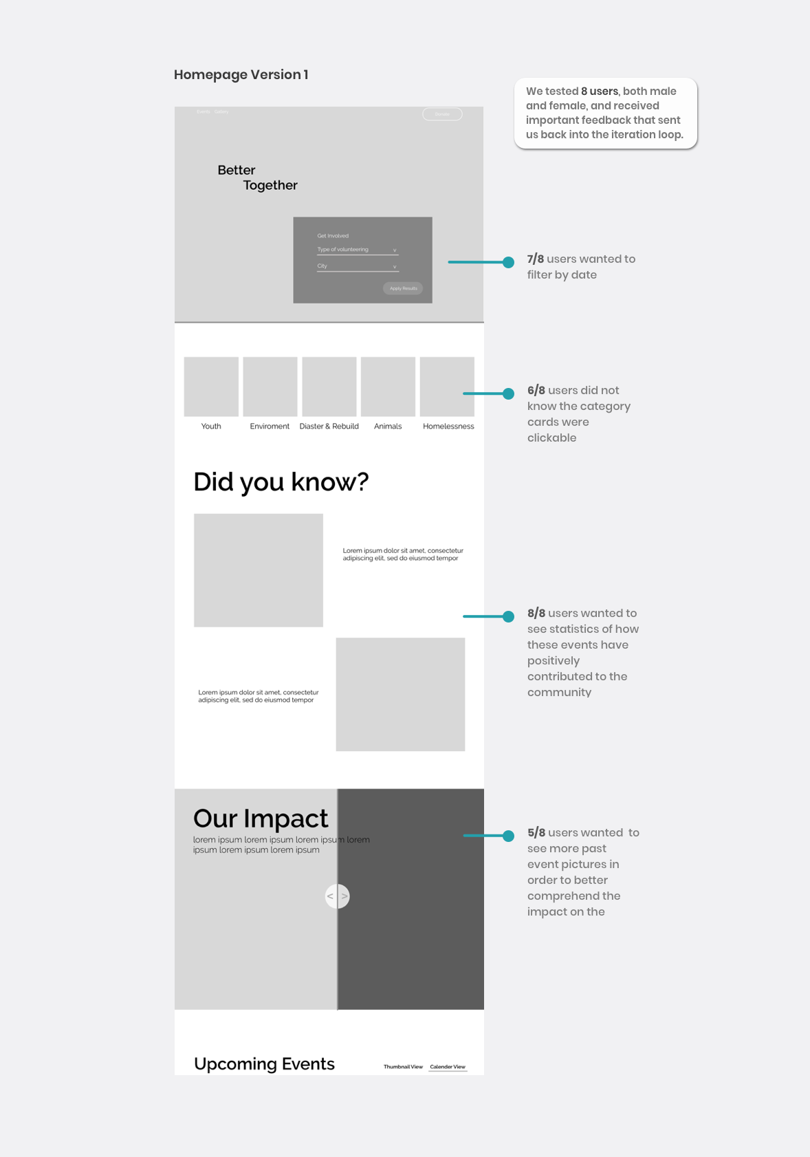
Homepage iteration
T
Testing results
We asked our testers how they would search for an environment event, 6/8 testers used the environment grid card.
We asked our testers to show us how they would find and register for a beach clean up event in Miami. 5/8 testers used the search widget.
ITERATE
“…we treat everything as an unfinished product that will always be iterated on” -IBM Design Thinking
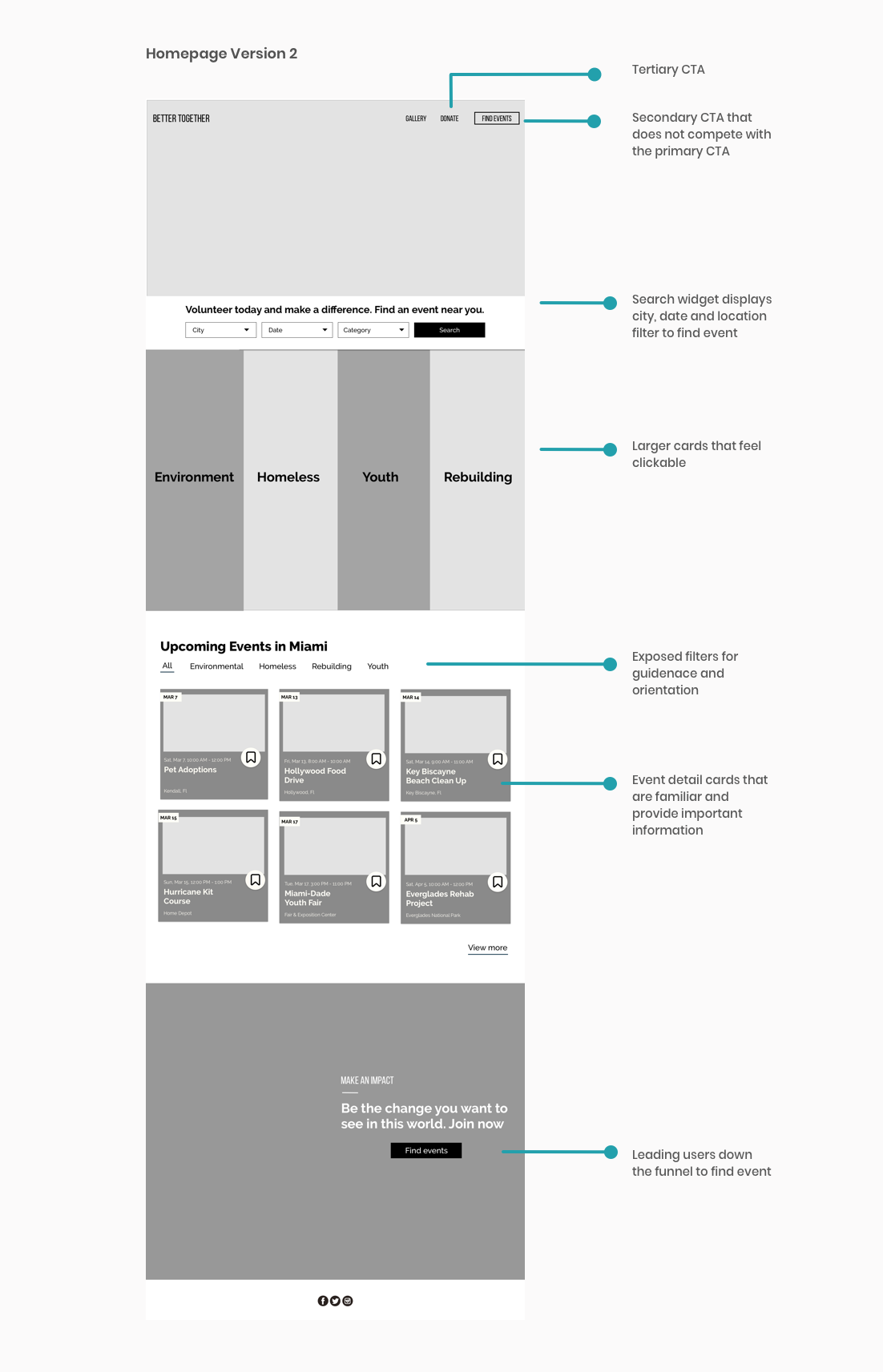
Alter design
Exploring and testing, relentlessly.

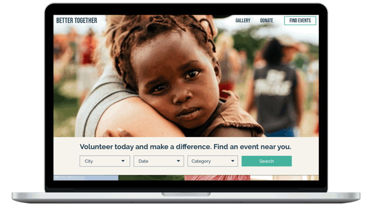
Hero testing
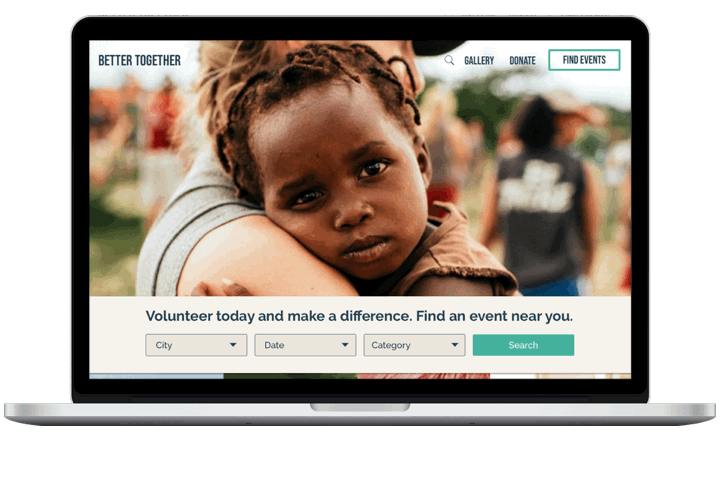
Multiple rounds of testing to find the right hero image. After over 15 iterations, we inferred the best choice.

The delivered product & design decisions
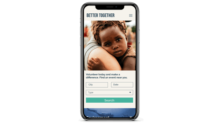
Responsive Design
Following mobile best practices we designed this product with finger-friendly tappable interface, hamburger menu on top nav, and Luke W’s form design.
LAUNCH
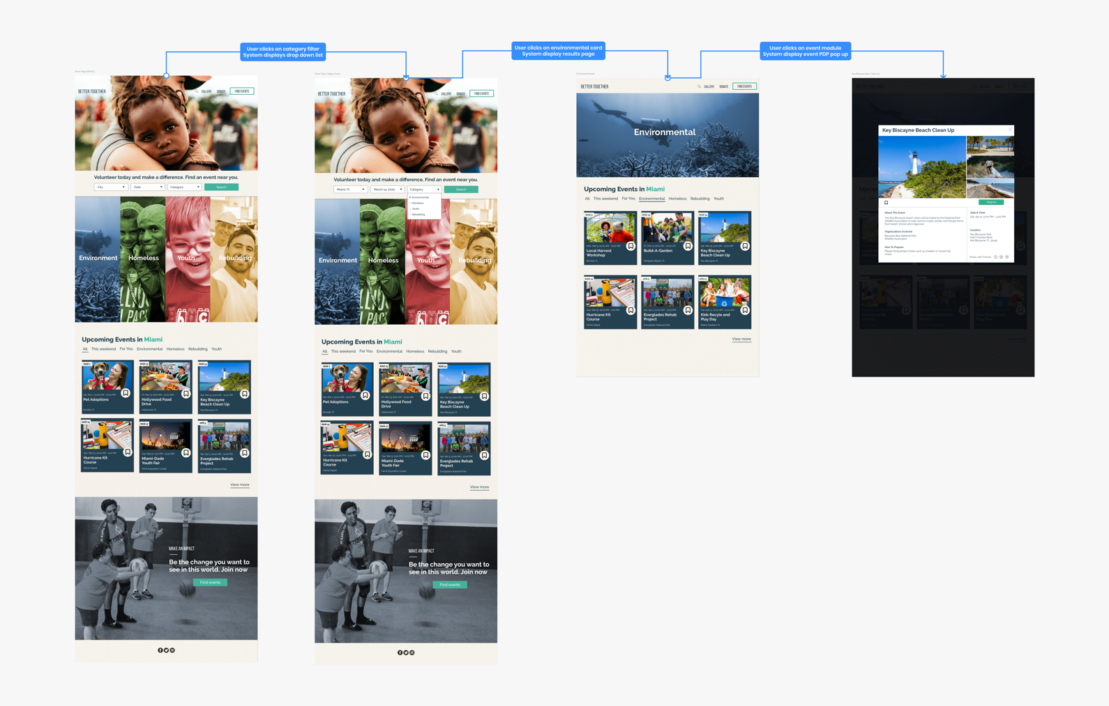
Flow charts
Task flow charts helped us solve any communication confusion the developers might have when they were building the site while also making sure the design directed the user down the funnel.
Animations via keynote
Sticky nav for ease of access